On the Importance of Style Tiles
10 Jan 2022Before a product road map, before UX design, before any code was written, before any funds were raised, we made a style tile for our startup.
Purpose of a style tile
A style tile’s core purpose is to provide explicit patterns for the design of an app. This includes colors, shapes, buttons, typography, iconography and even an image that embodies the core “feeling” of your app.
However, the purpose of a style tile for startups goes far beyond just defining our personal style. Our style tile has
- sped up the design process by reducing the number of choices available to a designer and allowing non-designers and one-off contractors to build out website pages, mobile app screens and decks with minimal oversight;
- kept our designs consistent across our mobile application, website, and pitch decks; and
- aligned and bonded our team through the creation process.
How to build a robust style tile
The process consists of three parts: 1) defining the company’s brand, 2) creating moodboards, and 3) building the style tile.
Define your brand
Defining your brand is a key team building and team alignment exercise. Collect your team for a brainstorm, prompting your team to write down words that they would associate with your company. For example: if your app resells designer clothes, perhaps a few of your words would be “luxury”, “statement-making”, or “artistic”. Aim for at least 25 distinct words total, and don’t worry about synonyms.
Next, cluster your words that go together or are synyonyms. For example, some of our word clusters were “luxe, chic”, “energetic, bright, sunny”, and “fun, playful, spontaneous”. Throw out any words or clusters that the group believes don’t fit the brand.
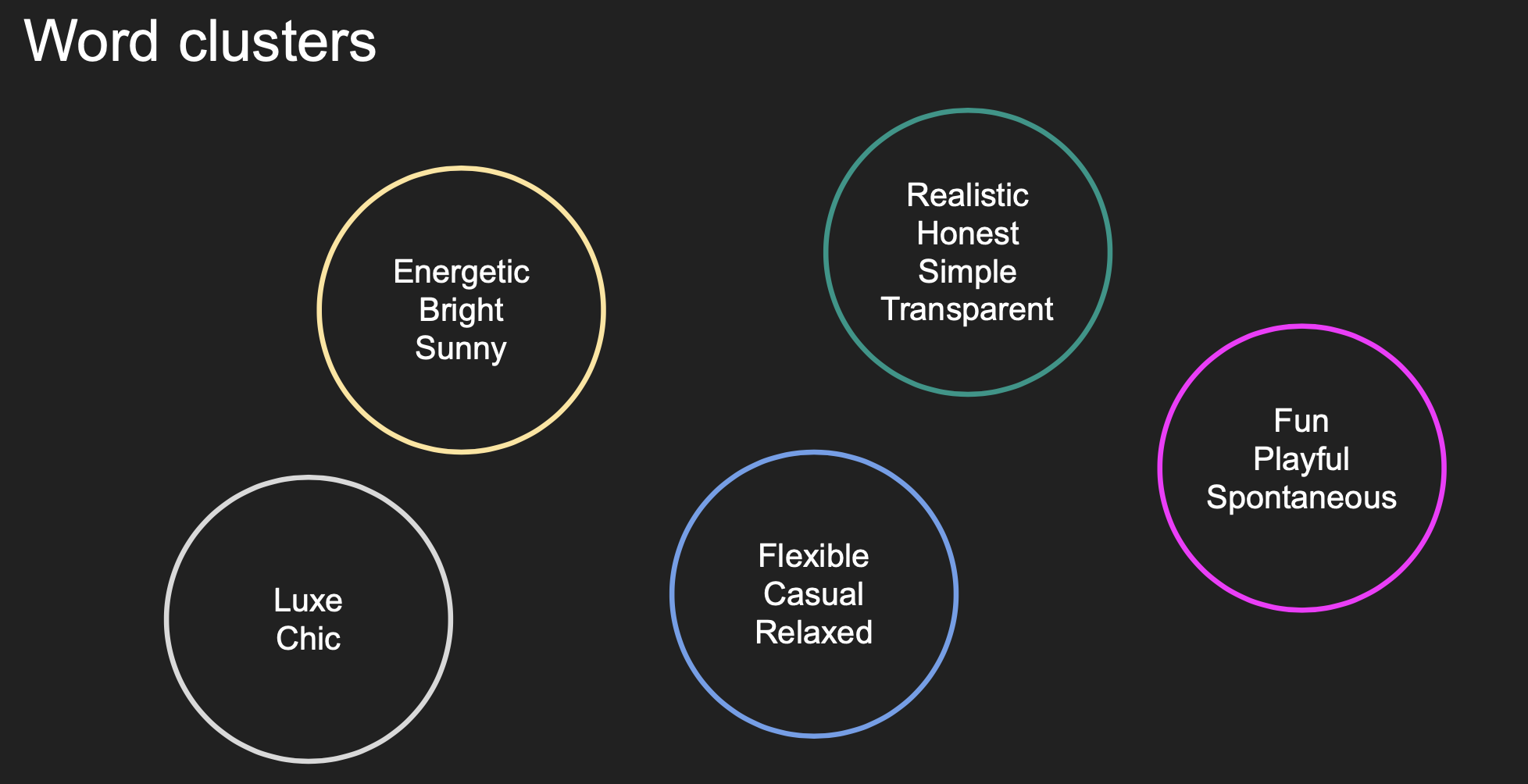
Finally, choose your favorite ~3 groupings of ~3 words. Ideally, each grouping should attempt to encapsulate the many dimensions of your brand in a succinct way. This likely means only choosing 1 word from a cluster for a specific grouping, such that your groupings don’t include synonyms. You can choose multiple words from a cluster if you believe they are different enough and help describe your brand in its entirety. Continuing with the earlier example, your groupings might look like “energetic, spontaneous, chic” and “sunny, fun”.
Create a selection of moodboards
We can call each word grouping you just created a “mood”. Now, for each mood, create a moodboard. A moodboard is a document that has 4-8 images that reflect the mood of the board and maintain visual consistency with each other. Because of the consistency requirement, finding your first image for the board is incredibly important.
Here is an example of one of our earlier moodboards. You’ll notice that the center image was the first image chosen to match the mood (the words at the top).
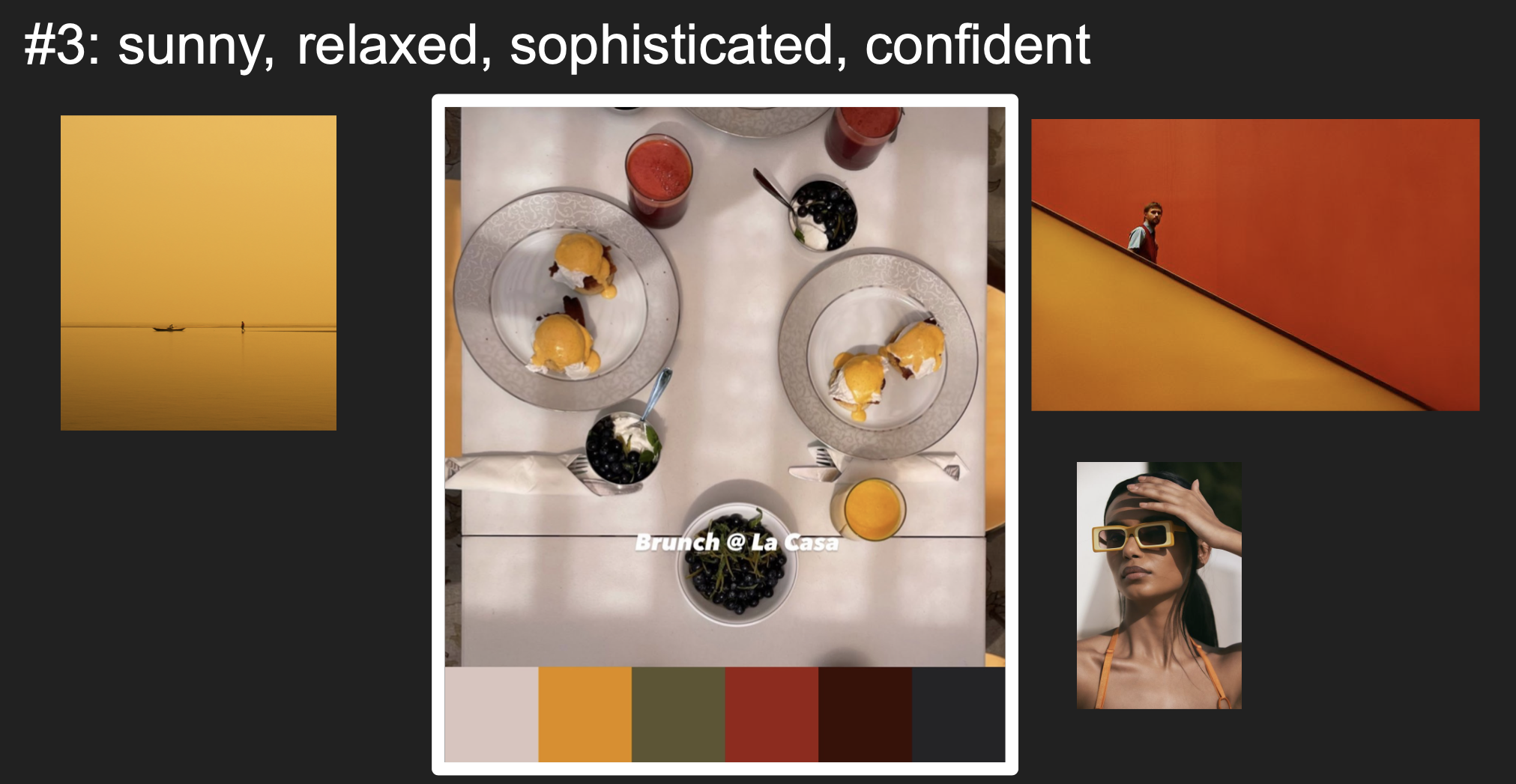
The colors are consistent across the four color axes of Hue, Tint, Tone, and Shade. To me, what additionally makes them come together visually are the very strong, simple and distinct lines, circles, and rectangles. Visually, the images are minimalist and constrast-y.
Ideally, your images should invoke your words, and your words should invoke the images.
Lastly, we added color palettes to the base of our moodboards to visualize more clearly the colors associated with all the images.
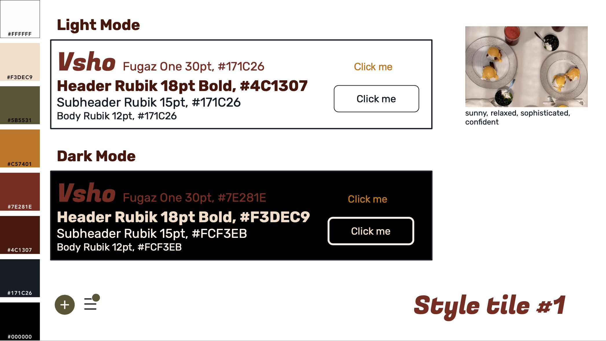
Build the style tile
Once you have your palette from your moodboard, you start to build your style tile. I like to include the palette in large blocks along with each color’s hex code. Then, you can include topography choices, button choices, iconography, and spacing options. Finally, I add the photo and words that inspired the tile.
Particularly when designing mobile apps, dark mode is incredibly important. At this stage, you will want to ensure that your palette has a couple of lighter colors, darker colors, and bright colors. Most web pages and mobile apps include white and black as base colors: basic dark mode will be white on a black background, and basic light mode will be white on a black background. This is very easy for users to read, even if a little boring. Don’t stray too far from white and black: I’ve seen a navy and light sand color combination do well, but a yellow and green combination – although it is the combination I use for my terminal! – might be too bright for most users.
You’ll need to choose topography for your titles, headers and body text – if you’re a beginner, I enjoyed reading On Web Photography by Jason Santa Maria.
Below is a somewhat early draft of a style tile we explored.
Team alignment
This is a deeply collaborative process not just limited to designers. We found that we had quite a few pivotal conversations about our differing visions: one person found a color scheme too ‘lazy’ for our application, and instead we found a scheme that was ‘inspiring’. For our team to achieve alignment over our final style tile, we had several brainstorms and many iterations of moodboards and style tiles. Investing time and work here was well worth it for us.