What Is a Product Teardown?
10 Mar 2022When I worked at Dropbox, one of my favorite Friday product team rituals was the Product Teardown. Around 5pm, the product team of our division would gather in a conference room and the leader of the discussion of the day would cast their phone or computer for everyone else to see. After navigating to the product of the day, we’d begin the teardown.
A product teardown is an effort to break down a product into smaller parts to understand the product’s competitive advantage and differentiators, customer base, core value prop, and future goals. It’s a product person’s ‘reverse engineering’. When done in a team setting, a product teardown serves as a team bonding exercise but also as a way to learn from each other’s experiences and point-of-views. It can serve as competitive benchmarking as well. A product teardown is not meant, however, to be overly critical. The ‘teardown’ refers to taking the product apart to better understand it; it doesn’t refer to ‘tearing it down’ in an unsporting way.
So we’d start the teardown with the start page of the product – for example, Github.
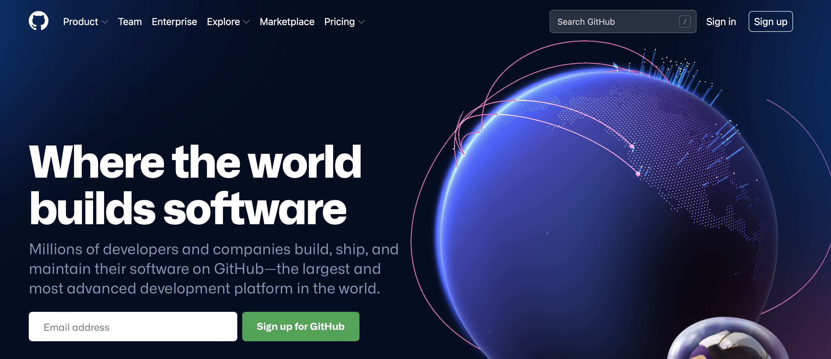
Next, it was a free for all: any observation was a good observation. The page branding is digital and futuristic, and it perhaps appeals to technologists. Who is this page built for? It doesn’t look like it is built for an individual engineer; instead, it appears to be geared for IT decision makers because a top value prop offered is ‘Increase developer velocity’. ‘Where the world builds software’ is a good tagline – Github wants to be the destination for all coding. The sign up button is very eye-catching, and clearly is dominant call-to-action (CTA). Alternatively, Github thinks that you could have also navigated to github.com to search or sign in, and offer those CTAs in the top right. What is a little strange is the collection of buttons in the top left: they range from a dropdown for drilling down into the core product to individual tiers pricing to a collective pricing page that compares their pricing plans. It feels like an odd collection of buttons, and it could be a good discussion to understand why those buttons were placed there. What is the goal of this page? Do all these elements serve that goal?
And all of that is just based on the very first landing page.
What we did next depended on what we were interested in. For a few quarters, we were very focused on our onboarding, so we would definitely sign up for a new account and make our way through the flow. We’d be careful to document what we didn’t and did like.

Here is Github’s first page after one clicks the ‘sign up’ CTA. It clearly is appealing to those who have played CLI games and gamifying the sign up process. This is a common tactic that companies use to get users to sign up and complete onboarding. Github’s approach is very cute, but has a downside: it appears to lean into the stereotype that developers enjoy gaming, Star-Wars-like fiction, and using their terminal. The greater universe has always been a part of the GitHub brand, but perhaps it should be revisited since software development these days has a more universal (yes, it’s a pun, but it was GitHub’s original pun for all the space branding), wider appeal.
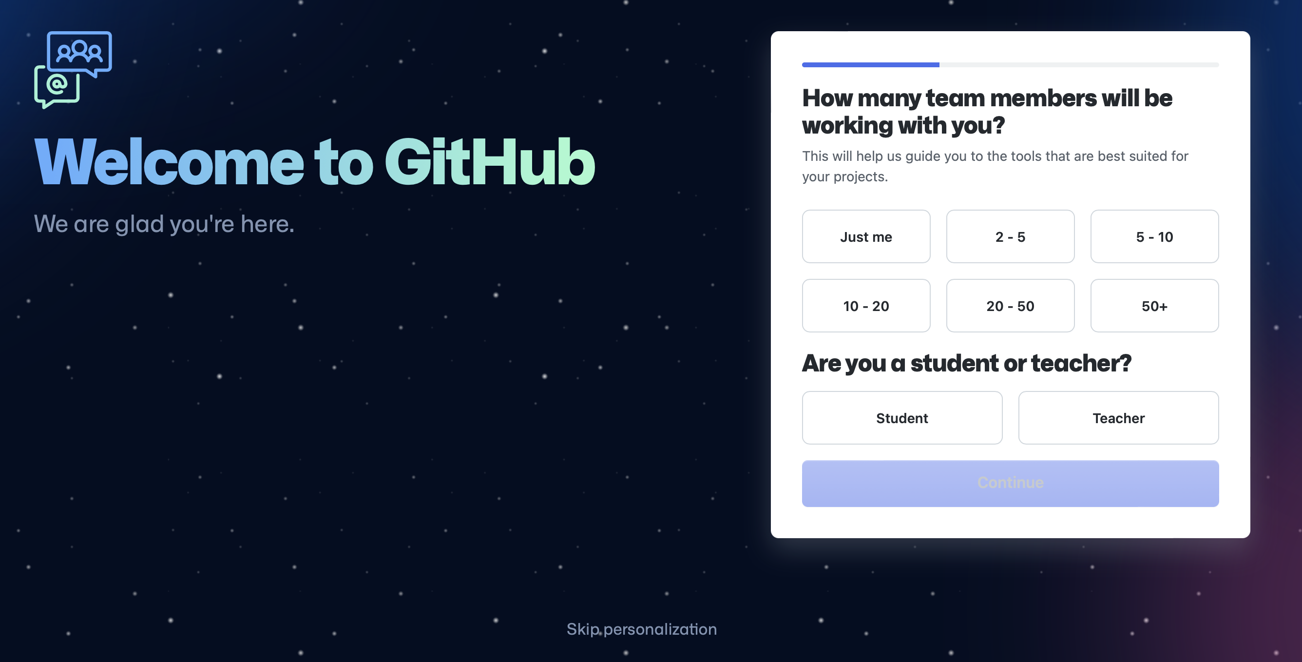
Lastly, before we move past this section, we’ll see an option for us to ‘personalize’ our onboarding and offer more information about ourselves. Companies will ask users why they are signing up for the product and who they are, and if they are part of a larger team, to conduct light user research, personalize the onboarding, or pass the information to a sales team member.
On the user’s side, people like personalizing experiences and will fill out some information to enhance their own experience.
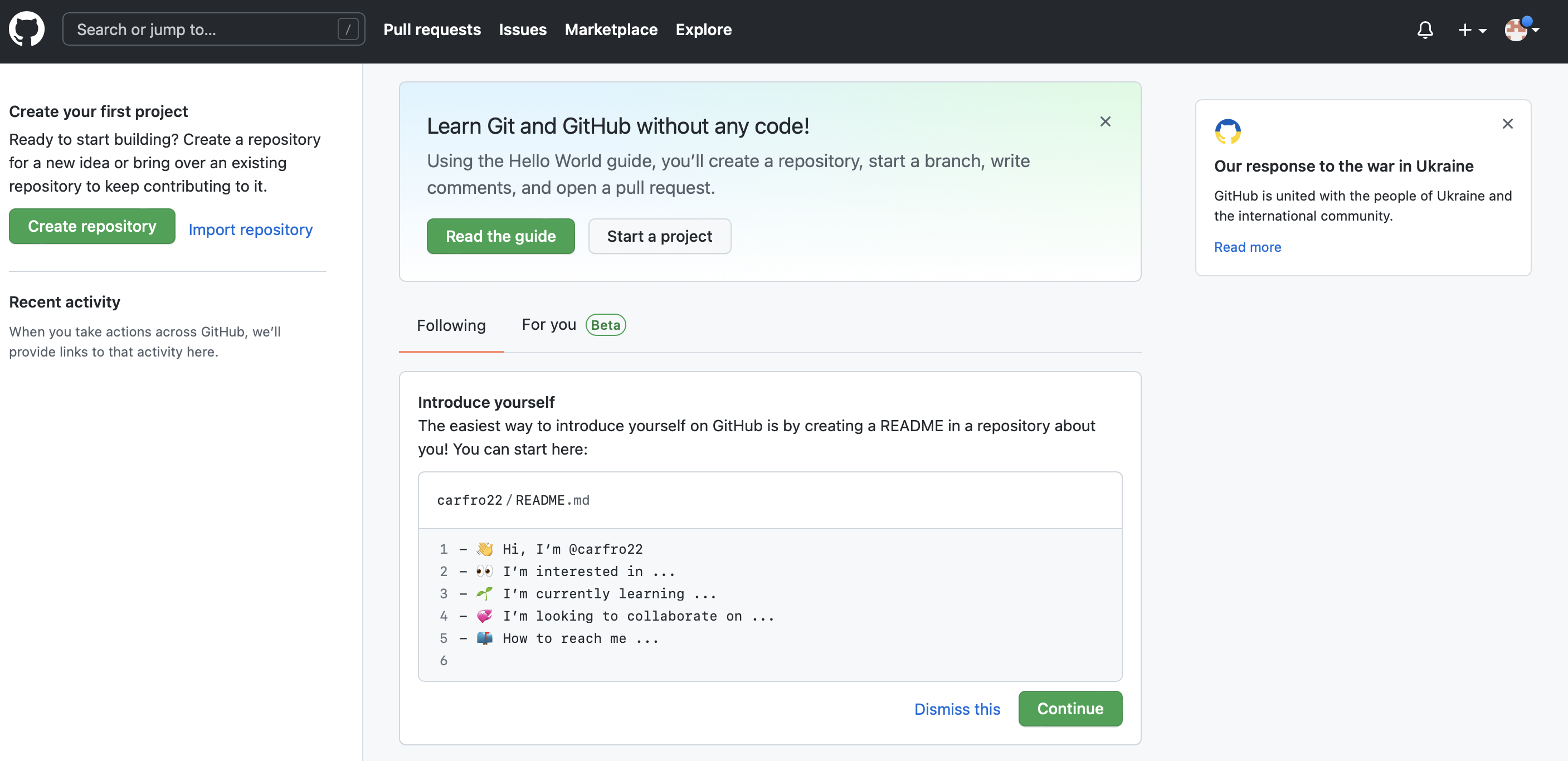
Once we’re all signed in, we take in the Home page. There are three competing CTAs(‘Create Repository’, ‘Read the guide’, ‘Continue’). It is interesting that they don’t tell you what to do first. It’s very hands-off. A lot of onboarding for apps and websites follows Facebook’s now infamous 7 friends in 10 days in that the onboarding drives you to some key action. The company believes that you will be much more likely to retain if you complete this key action than if you don’t. The key action is a point where the user will have had an ‘aha!’ moment and understand the value of the application.
It’s unclear what Github is driving the user to do to understand the value of Github, especially since they know I am an individual user. I think for individual users the most valuable part of Github is the other open source repositories and keeping track of different versions of one’s code.
This is a complicated set of tasks to complete, but Github does push you into a quickstart guide for creating a repo with the ‘Read the guide’ CTA.
Next, we might deep dive into the notification setup, the available privacy settings, how two people might work together on Github, how the mobile app integrates, or other products the company offers (like Marketplace). We might focus on user interactions and user interface design choices or the organization of the product. Our conversations will begin with an observation (“I noticed x”) and the follow-up question (“I wonder why they chose to do this”) or even an early position (“Their larger strategy must be y”).
At every point, we bring back our observations to the product’s competitive advantage and differentiators, customer base, core value prop, and future goals. At the end of the teardown, we want to understand the company and its product pretty well and be able to guess at its strategy. If we haven’t run out of time – and at this point, we usually had! – we’d discuss how good of a strategy that might be.