Choosing App Navigation for Vsho
19 May 2022As you might have noticed, most mobile apps conform to having 3-5 main pages of their app, all available at the bottom as part of their bottom navigation bar. There is a tab for each of the main pages of the app on this bar.
We spent about a week deciding where our navigation bar would live and what our navigation bar would include. This is our process, and framework for making these design decisions.
We brought together three main sources of input to make decisions around our navigation: creating a framework for our decision, looking at comparable apps’ navigation, and utilizing critique sessions with target user personas.
Creating framework with two core values
Our framework for deciding app navigation recognized two ideals: first, most common, app differentiating, core actions should be easily accessible. We wanted users to derived value from our application as quickly as possible, and common actions that we want users to take in our app shouldn’t require many clicks. For example, since we wanted our users to be able to post quickly, ‘Shoot’ was a separate tab in the center of the navigation bar. Additionally, we knew community was a core value to our users, we created a ‘Corners’ tab as well (‘Corners’ was our version of a page to keep track of a user’s various communities).
Secondly, we wanted our navigation to resemble a balanced tree. Every tab in our navigation bar should contain a similar depth of tabs, since we felt that logically this was the easiest organization for people to understand. For example, since on our Home page was both the feed and the ability to search, we felt comfortable putting settings and viewing/editing a person’s profile on the profile tab.
Looking at comparables
We collected ten or so mobile apps in the social media space, and analyzed their navigation organization. It is so incredibly important to understand existing standards. Users are used to these navigations already, and designers of these mobile apps have already invested a lot of time to create thoughtful navigation systems for their users.
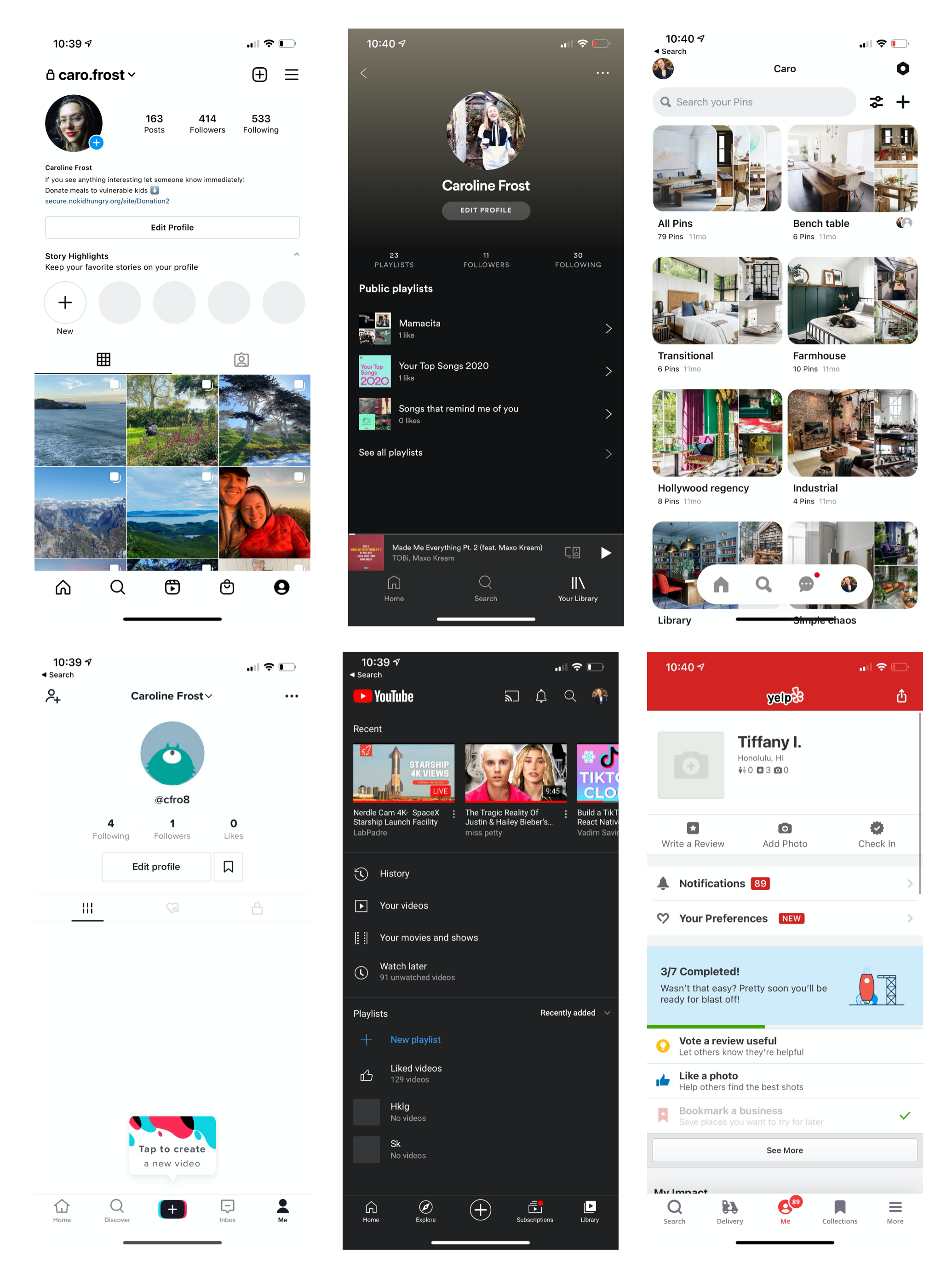
You can see that the apps above all have bottom navigation, and some have a top navigation too. It’s worth noting that these are all iOS – we were developing for only iOS at the beginning – and Android would have a separate flair.
Additionally, all of these apps had 3-5 tabs in their bottom navigation. We thought it was interesting what apps included in their bottom tab, in what order, and in what colors for both light and dark mode. Generally, the apps seemed to put the most important page in the center of the bar. For example, Instagram is currently on a company-wide push to increase the usage of Reels and ads in the Reels feed. The other most important pages or actions fill out the rest of the bottom navigational bar.
The top bar is reserved for branding, underscoring where the user is in an app, extra important features that can’t be squeezed into the bottom bar, or important features that need to be available no matter the page a user is on.
Finally, we took note of whether an app included text along with an icon on the navigation bar.
With our framework and target user in mind and the features we wanted to include, we decided on 5 pages, no text, and no top bar (at least for now!).
Utilizing critique sessions
Finally, when we had a navigation organization that we were happy with presenting, we took it to potential users and influencers to get their reactions. With a few tweaks, we had a navigation bar we wanted to develop around.
•
This was one of my favorite design decisions to make. It required a lot of thought, especially since we didn’t want to reverse our decisions later, if possible. It took a great amount of creativity and research and I’m very proud of the team’s output! Below is an image of the app and our navigation bar in the real world. Our final list of tabs, from left to right, went like this: Home (which contained our search functionality), Corners, Shoot, Shop, Profile.