Utilizing Testflight's Waitlist to Gain Funding
19 Sep 2022One tactic for social media apps to gain funding without launching is to fully utilize Testflight and its waitlist functionality.
By solely using Testflight to launch to your first 10,000 users (the upper limit allowed), you can can circumnavigate some of engineering costs of building an app for the apple store. 10,000 is plenty for user research purposes, and if you manage to fill the 10,000 spots you then have a waitlist. This makes for a very compelling value prop for VCs: look, there is a lot of demand for this app! It’s a great strategy to raise funds.
However, waitlists can artificially inflate demand, and even a very long waitlist won’t help if the app has retention problems. Additionally, it is difficult in the long-term to take many shortcuts in engineering. While you need to prove that your solution has significant demand, once you have demand, the focus immediately turns to making up for those shortcuts at a time when you want to focus on growing and continuing to meet that demand.
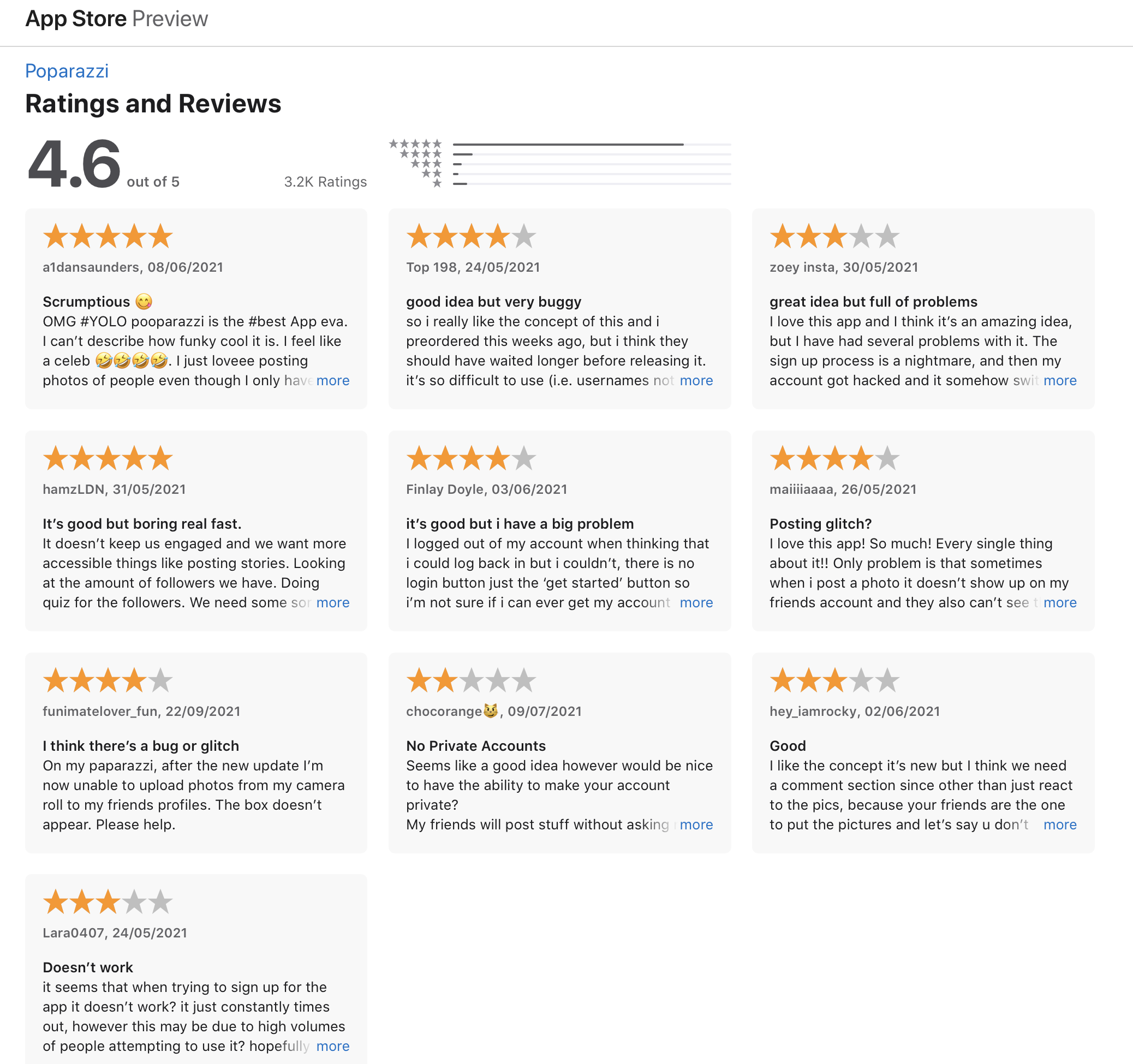
For example, an app that utilized Testflight succcessfully to receive funding is Poparazzi.

I love the premise of the app, but noticed that the app lacks a nuanced design and has reports of some strange bugs in authentication flows. I wonder if Poparazzi’s strategy was to take more technical and design shortcuts to gain users in order to gain funding leanly, but now has to think about the redesign of their app and reevaluate the engineering makeup of their team.
However, doing the opposite has its own issues. Building more upfront and spending more time in design is a wasted effort if one’s growth doesn’t take off. We ran into this problem at Vsho – upfront, we invested in engineering sustainability and nuanced user experience, but didn’t successfully hit our growth targets. Our investment was a wasted effort.
That being said, I think there is a middle ground: Vsho could have taken more shortcuts and utilized Testflight more efficiently prior to launching, and I think apps like Poparazzi could invest more upfront in user design and engineering. Vsho didn’t need to use react native and didn’t need to launch to the app store so early, but I am glad that our codebase and novel user experience design is still very usable and can be reused for a different project.