In Defense of Branding for UGC Mobile Apps
01 Oct 2022I’m tired of the harsh, absolute minimalism of phone applications that came of age in the 2010s. There are good reasons to choose minimalism, especially when an application focuses on user-generated content (UGC) like Instagram. Minimalism has started to appear dated and I no longer like the look of brandless, boring apps.
For example, let’s take a comparable page in Instagram and TikTok: the ‘Find your friends’ page. It’s worth noting how similar these two pages are, but I’m focused more on the differences.
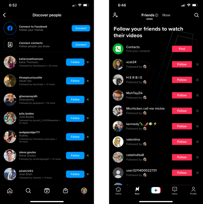
I think it’s interesting that Instagram seems to have adopted the Facebook (Meta) blue. Blue is a common color in mobile apps, since it is still very easy to see and isn’t as heavily connoted as pink (“feminine”) or red(“anger” or “warning”). Yet, blue is boring. It is incredibly common. Facebook’s branding telegraphs straightforwardness.
I like that TikTok leaned into the magenta that it did. I think the subtle TikTok branding in the back reminds you that you are within the TikTok app. Although I personally don’t like the style of it, the many font sizes remain distinctive. TikTok has a personality, and it’s a little chaotic but very fun. As a result, it feels modern.
Another comparison I can point to is Slack against Discord.
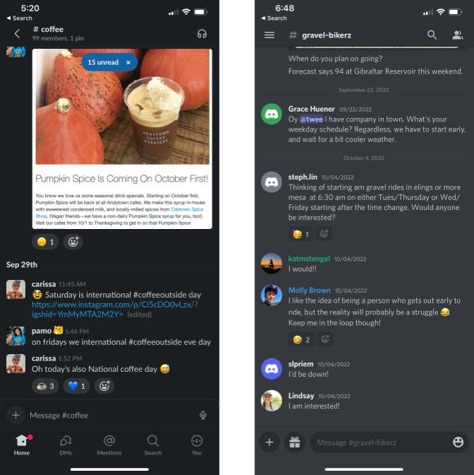
Slack falls into similar pitfalls as Facebook. It adheres to white-on-black and black-on-white with limited font differences and limited extra information. It too chooses blue as the only call-to-action (CTA) color. It wants you to focus on the text within each message. This makes sense, but doesn’t create extra excitement or interest for the user. It too is straightforward.
Discord, on the other hand, is more similar to TikTok in that it has a distinct personality. It chooses grey, not black, for its dark-mode background, which is not terribly common. It has several call to action colors, depending on what the CTAs are (in this photo, you can see pink, green, blue and purple. Pink and green represent leadership roles in the server). It spreads out the messages, which visually gives the app an off-beat feel. Lastly, Discord is not afraid to add even more information to the texts, like repeating the date. To not overwhelm the user, the navigation buttons are removed from the screen. I like the style of Discord a lot: I think Discord’s personality is off-beat and playful for such a utilitarian communication app.
I think the future of apps will go more distinctive as a reaction to ultra-minimalist apps appearing dated and uninteresting, and I’m excited for more color, fun fonts, and new design patterns.