Apple's Questionable Weather App Design
04 Oct 2022It’s funny that the first design critique that many Human-Computer Interaction (HCI) courses do together is to critique a weather app. Weather apps are so utilitarian and have been around for decades yet still are far from perfect.
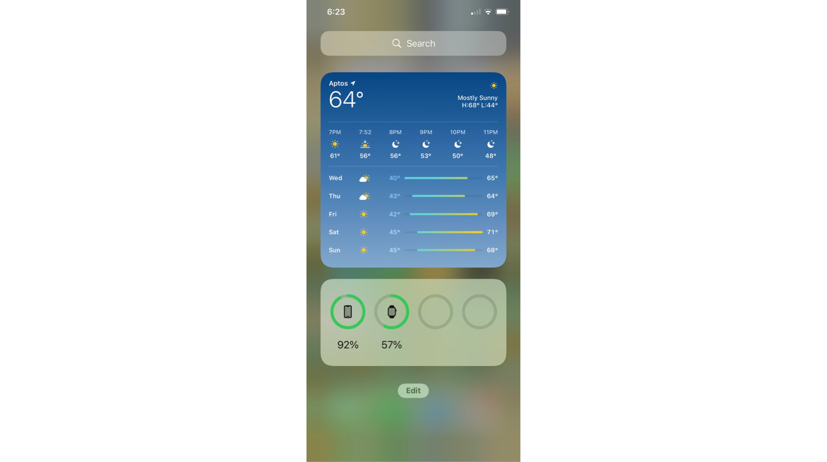
Quick: what do the grey bars that contain a cool blue to a light yellow mean to you? What do the numbers on either side indicate?
At first glance, it seemed to me that the numbers on either side of the bars showed the units across the entire grey bar, not just the cool blue/yellow portion of the bar. On a closer glance, the numbers actually indicate where the cool blue starts and the light yellow ends.
The reason why this is confusing is that conventionally in UX design information goes as closely as possible to the thing that it is describing. The numbers are closest to the grey bars and not the blue/yellow portion, failing this rule.