iOS 16 Is Actually a Very Interesting Update
09 Oct 2022It’s been awhile since I’ve been genuinely excited by a software update of Apple’s, since progress tends to be incremental lately. I was genuinely excited when iOS 13 introduced swipe-to-type, and when iOS 11 allowed automatic wifi sharing (although it seems to not work terribly well, still), and when WatchOS 5 introduced automatic workout detection. These moments were delightful as they reduce the amount of tapping on my phone that I needed to do to type, share wifi passwords, and start a workout. I’ve been excited about iOS 16 since it makes a few more things even more delightful for the user, and the visual upgrades are stark and fresh.
Search
First, I love that the search bar has moved from the top of the screen to the bottom, to sit right above the keyboard. As iOS screens have gotten bigger, its made more and more sense to group inputs with the keyboards, instead of forcing search to stay constant at the top.
Additionally, to search, you can either drag from the top of the screen, or the page tracking icon morphs into a search button when you stop swiping across screens (see blow photo). This makes a lot of sense – with the abundance of apps, I suspect many people use search now as a primary way to access apps, instead of digging across screens and folders.
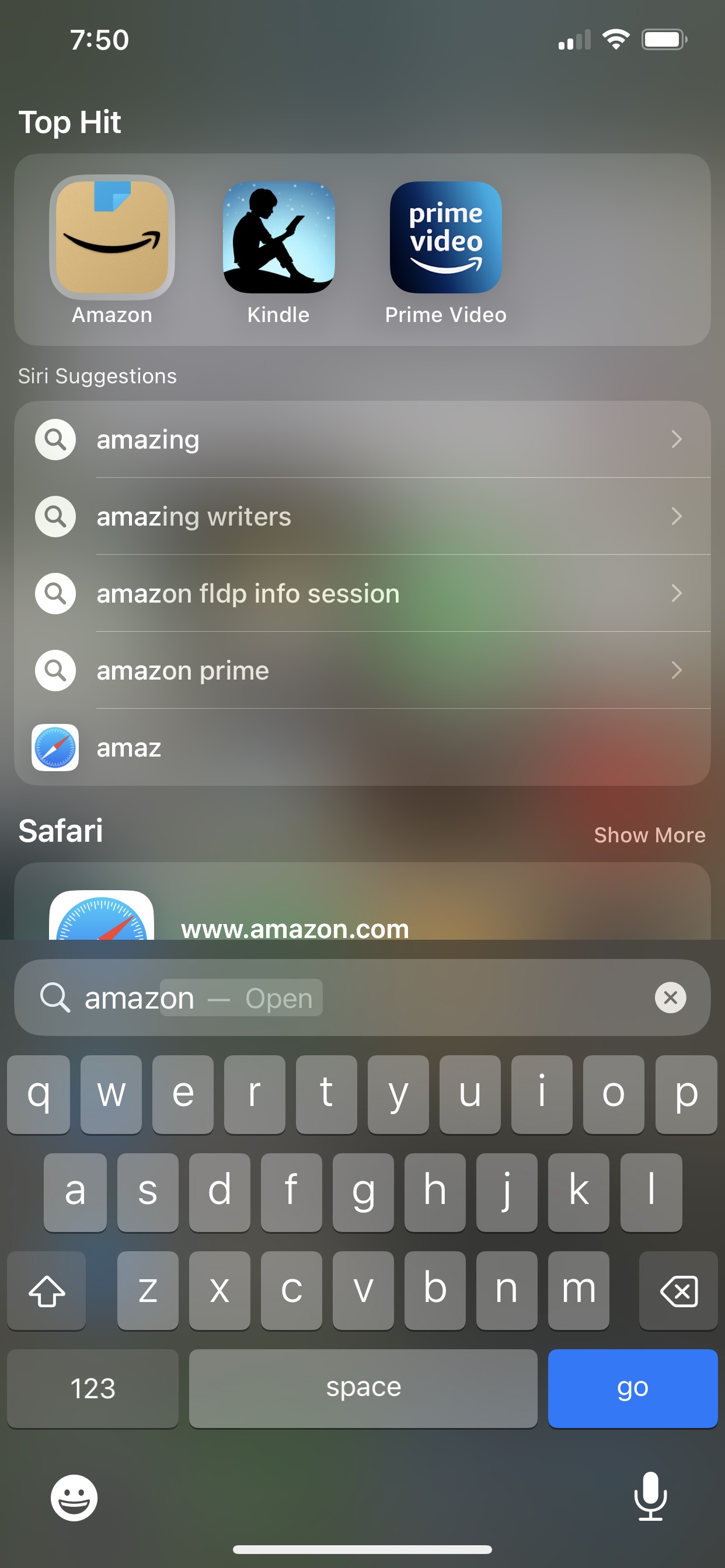
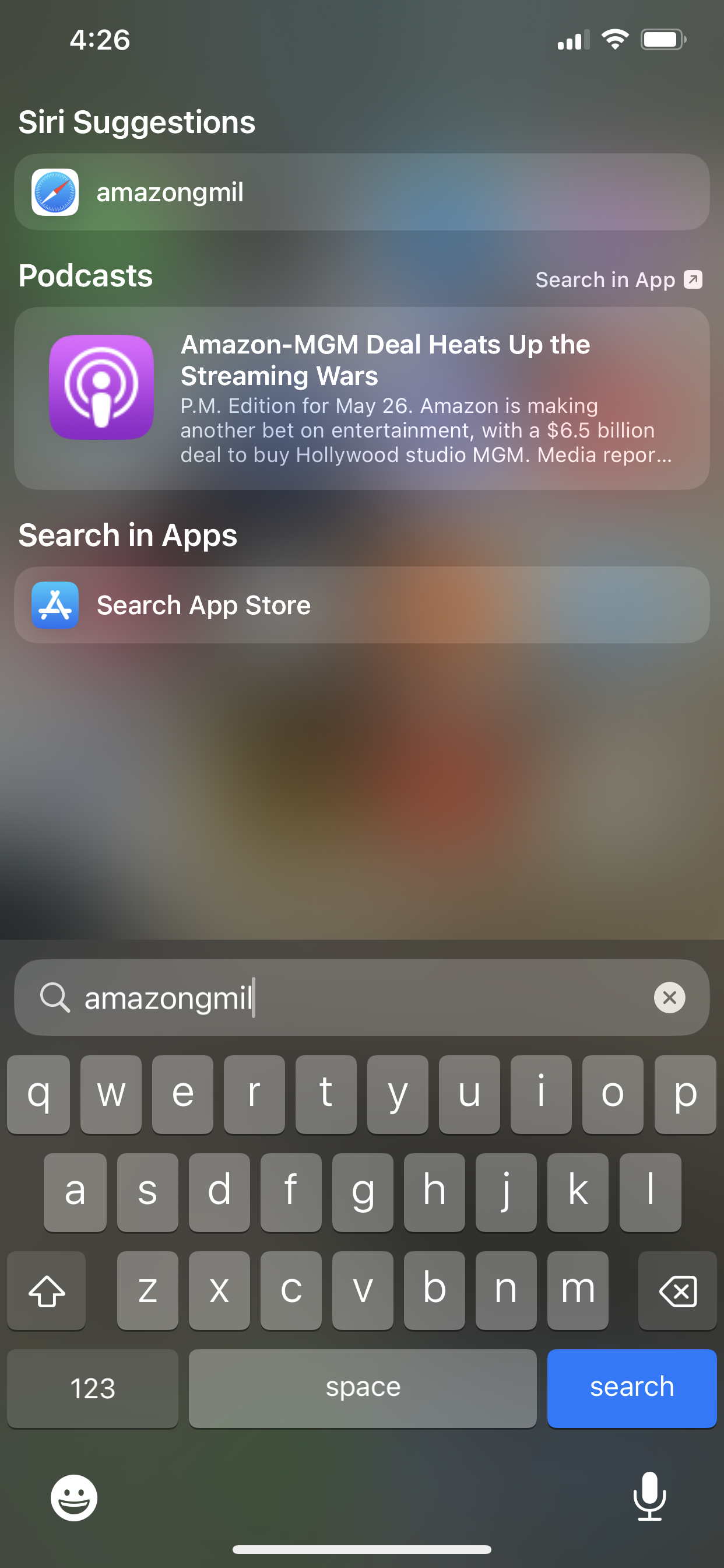
What continues to bother me is bugginess around search. Frequently does my keyboard not appear when I drag down from the top of the screen to begin a search. Additionally, this iOS remembers search terms for quite some time, such that instead of knowing to begin a new search for me, it starts concatenating search terms. Below, I first searched for Amazon, and then a few minutes later, ran into a problem when I began searching for Gmail and the iOS did not create a new search.
Lastly, search is incredibly slow – often, it doesn’t return results for several seconds.
Levels of privacy within phone
What is also interested to me is the new levels of privacy within a phone. Yes, you have to sign into the phone to have access to the phone in the first place. But then using the Apple wallet requires another sign in confirmation before buying anything or access wallet data.
This iOS also now blocks deleted photos in a similar way – you have to use Face ID or unlock with a passcode to access deleted photos. This makes so much sense to me – deleted photos are another level of privacy, along with hidden photos, than the general photos in the Recents album. I’m interested to see what other privacy layers Apple introduces.
Home screen
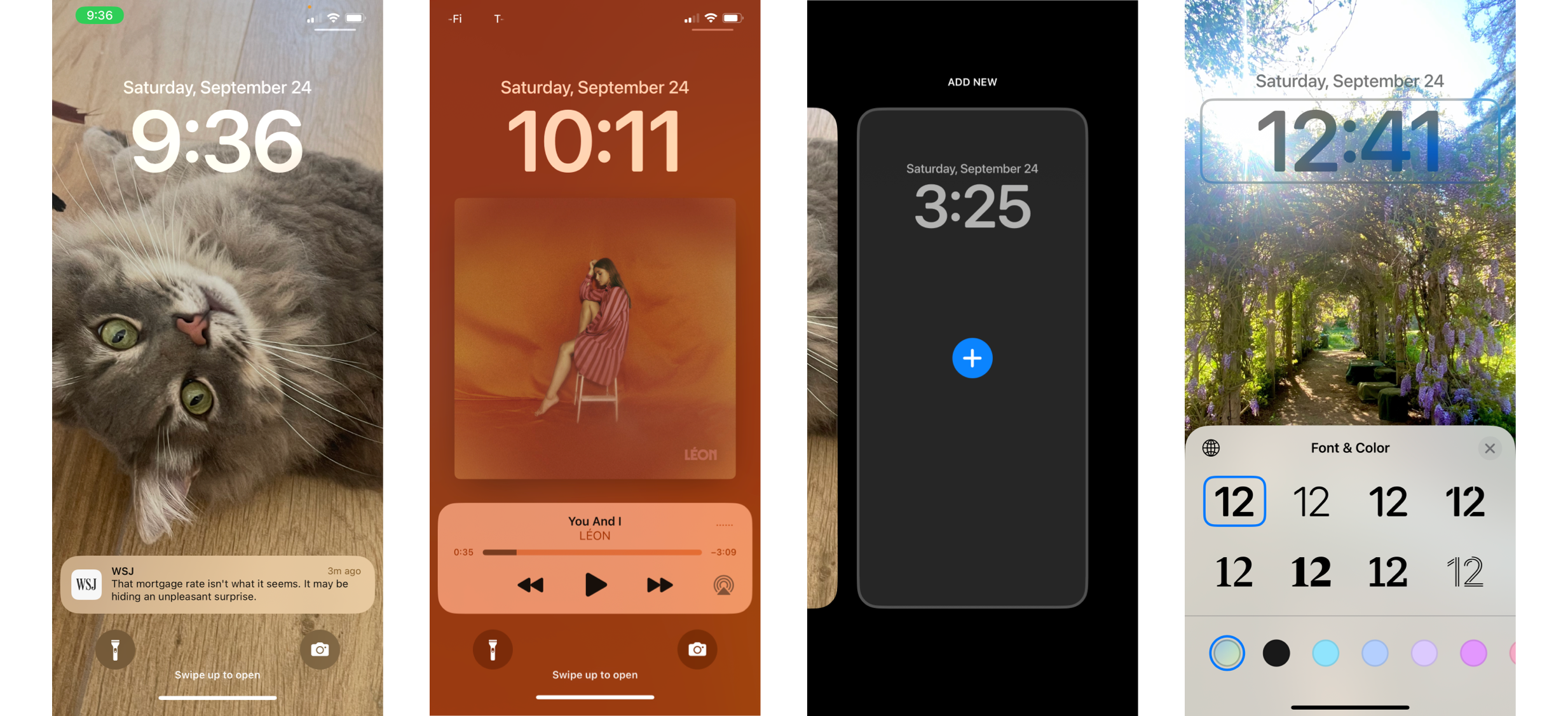 I was interested by the shifts in the home screen as well. I love the fresh look of notifications being stacked from the bottom, as opposed to the top, leaving space for reminders and calendar alerts (picture 1). I love that the screen changes color to match the cover art of an album you are listening to (picture 2). I don’t quite understand why you would need multiple home screens (picture 3), but its interesting nonetheless. Lastly, I love that you can now customize your home screen more than ever before (picture 4) – I think modern UX design should feature more color, and in this way a user create a more personalized phone experience.